
Revamp CarNow mobile app that increases performance and experience
Starting from scratch
In 2023, I joined a new startup called The Now Project. Its flagship product is CarNow, a used car marketplace platform that provides a variety of services for both consumers and dealerships.
After over a year of trial and error, we have grown our app from zero to 12,000 users, with 350 daily active users.
Double Diamond + Lean UX
Working in a startup environment allows me to “move fast and break things”. I apply a mix of Double Diamond and Lean UX methodologies to maximize creativity, enable rapid iteration, and gather feedback early.
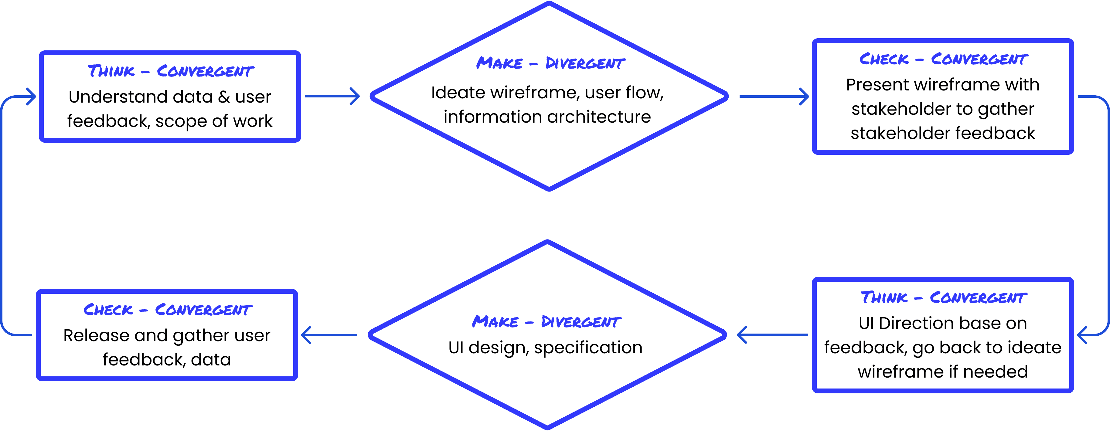
An example - Iterate CarNow’s information seeking experience
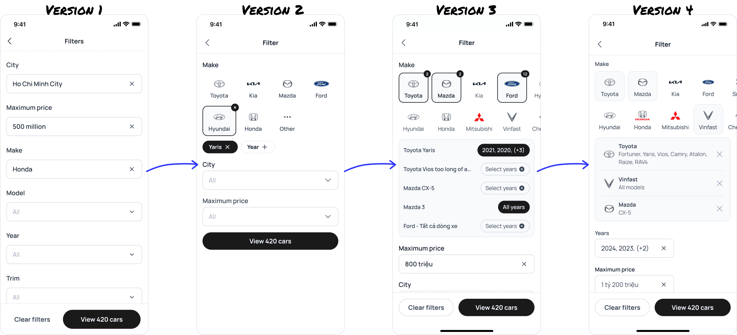
Searching for the ideal car was a vital user flow on a marketplace platform like CarNow. Through four iterations, we evolved the search experience from basic dropdowns to a versatile multi-filter system, improving usability and the user experience.
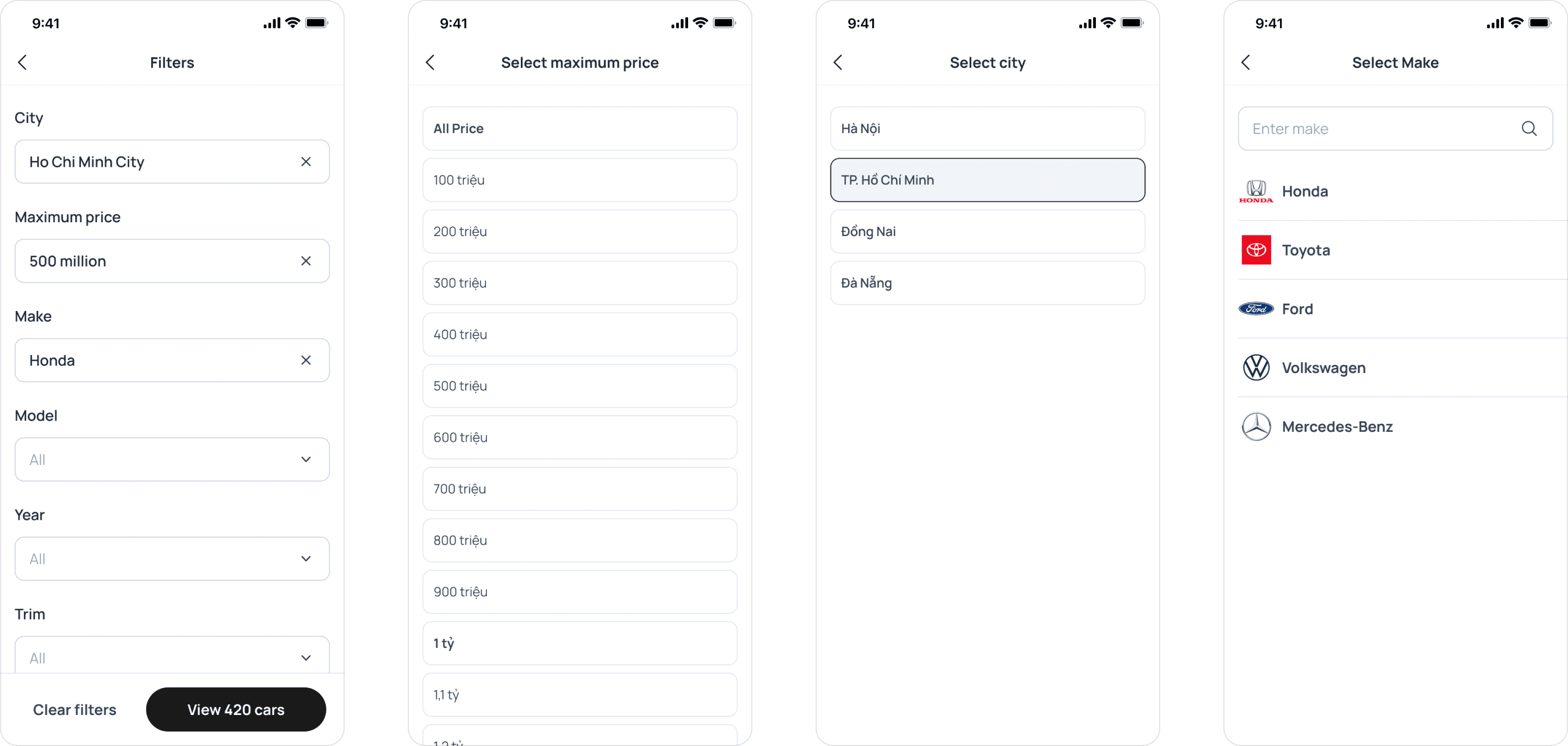
Keep the first version simple
The first iteration was simple, easy to implement, but it was also basic and cumbersome for users. It served as a good starting point for releasing the MVP to the market.
Post-release, we audited the feature based on user data and discovered new insights:
While cars are defined by four fields: make (brand), model, year, and trim (e.g., Toyota - Camry - 2023 - 2.5Q), most users only searched for make and model.
Users found it frustrating to navigate back and forth between multiple screens to select each criterion. On average, it took users 12.38 steps to complete the filtering process.
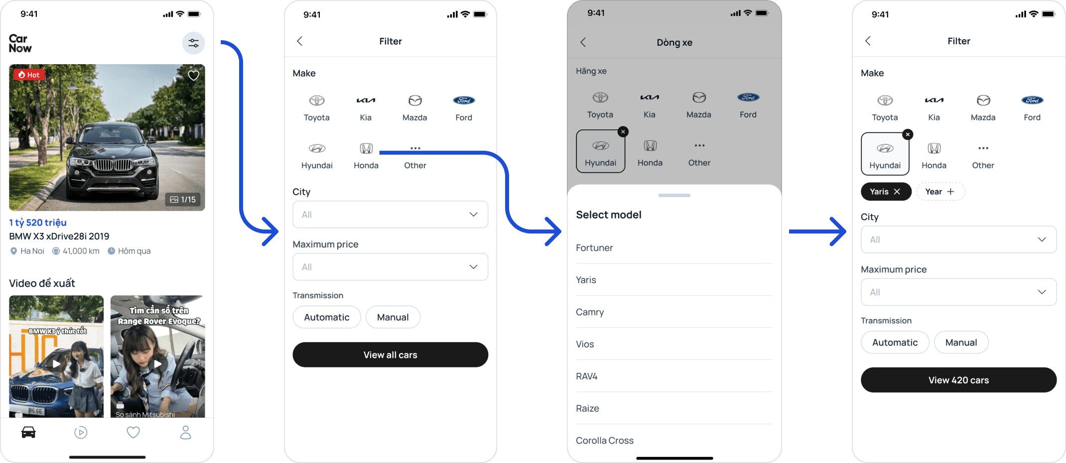
Improve the select experience on the second one
In the next iteration, following an ideation session with stakeholders, we focused on improving the user experience by:
Making it easier to select make and model by prominently displaying logos of the most popular car brands.
Removing the trim option to simplify the experience (less than 10% of users used it)
Using a drawer for selection instead of navigating to a new screen. While this meant sacrificing the search feature, the limited number of options made the trade-off worthwhile.
After release, we successfully halved the number of actions users take: from 12.38 to 5.6 actions per user.

Experiment with the third: enabling multiple models search
In the next iteration, we aimed to enhance the filter feature to create a more distinctive experience. While searching for multiple cars simultaneously was uncommon in Vietnam's car-selling landscape, we discovered that users often had several models in mind when car hunting. On average, they opened the filter screen four times to look for different cars within the same price range.
We tested the hypothesis that allowing users to find multiple models simultaneously would provide a more convenient experience, enabling them to view all desired models quickly.
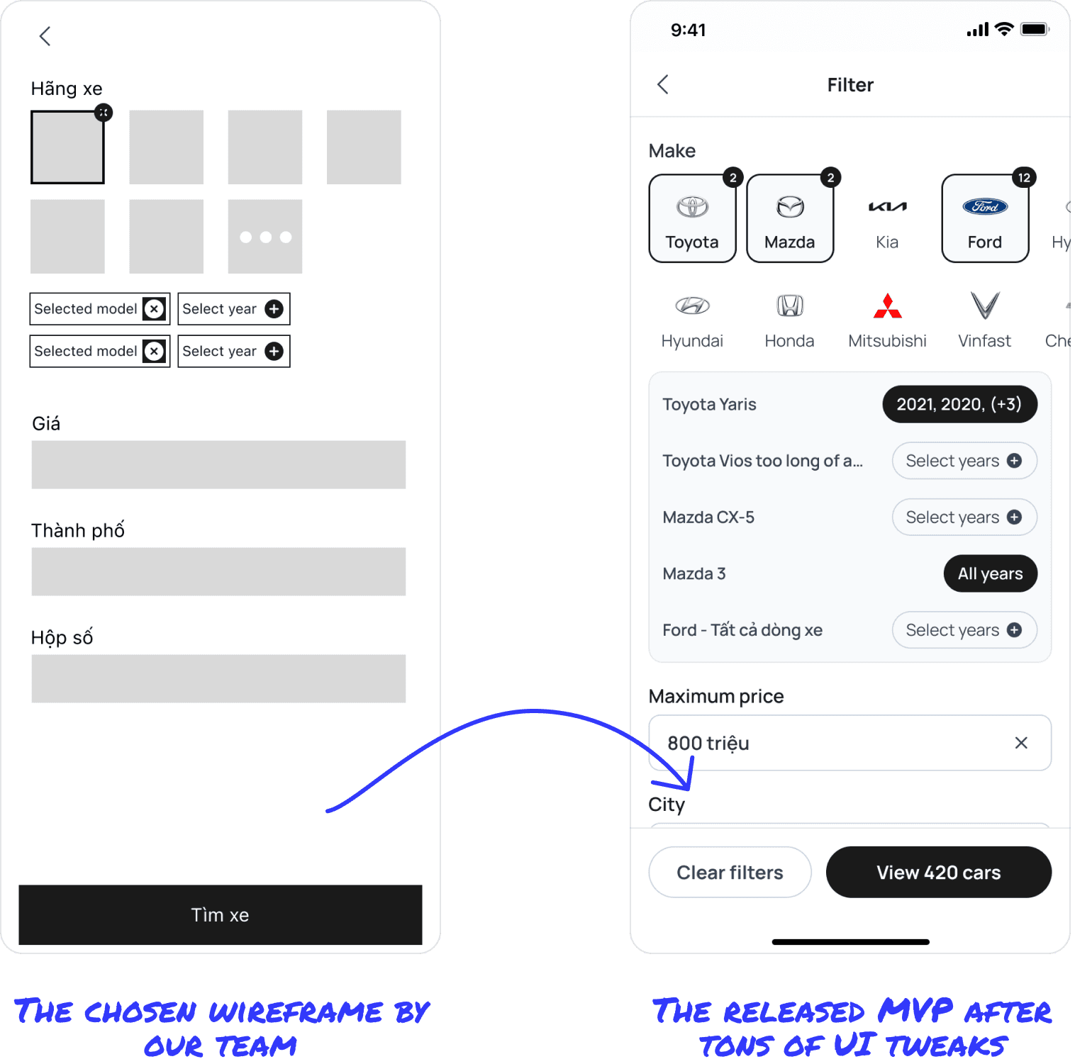
4th version: Learning from mistake
After a few weeks, here are the user insights:
While popular in overseas apps, multiple filters were quite novel for Vietnamese users; only 21% of queries involved multiple models.
Our design was too complex—most users set the same year range for all models.
Users found the UX for deselecting a model unintuitive.
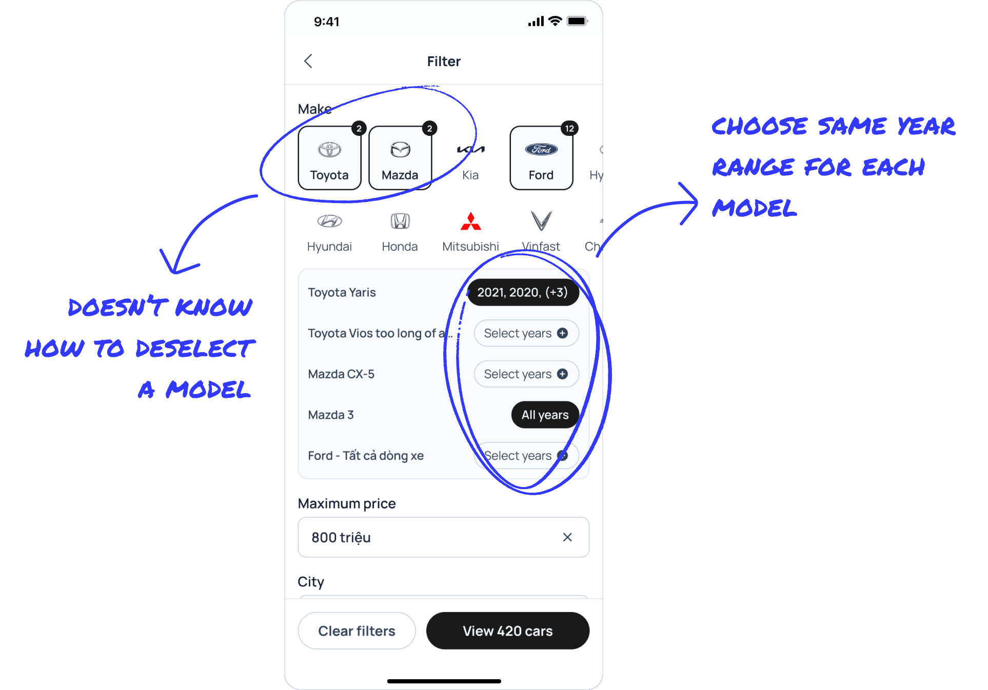
Based on the feedback, we created some "How Might We" (HMW) questions to ideate on the core problems:
How might we simplify the car selection process?
How might we help users easily deselect a model?
In the end, the final design addressed the problem statements by:
Moving the year selection to a separate fields.
Adding “x” buttons to deselect a brand.
Adding chips to the model selection drawer.

Results
The number of multi-filter queries increased from 21% to 26%, which was still lower than we expected.
The number of queries selecting years increased to 36%.