Redesign MSB banking app home screen
The problem
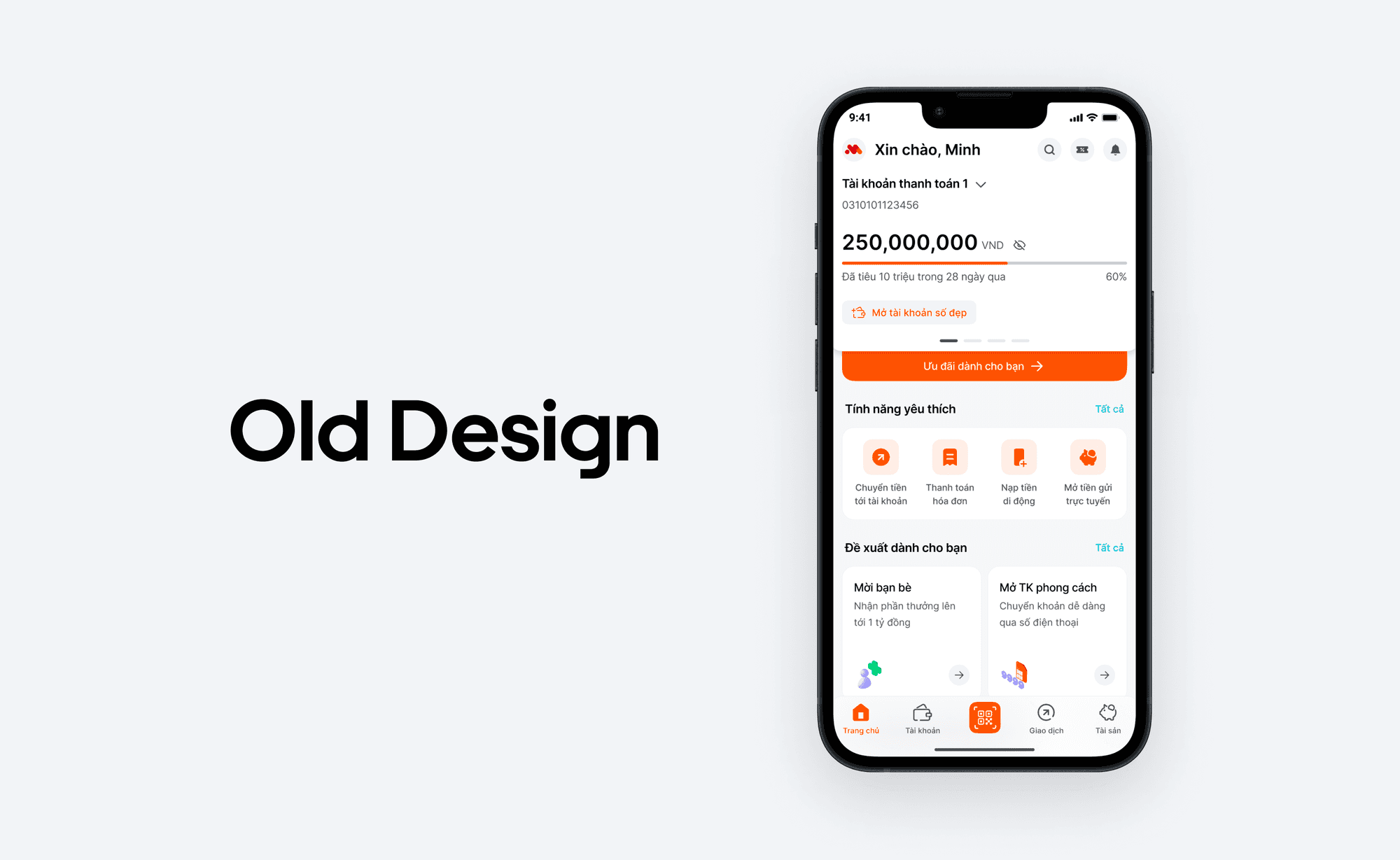
Feedback on our new mobile banking app have one important design problem: the homepage is confusing and clustering. Many user find it hard to find the feature they need in this screen. Base on this feedback, our design team decide to redesign the homepage to create a more pleasant looking home page
Each team member will come up with some new version of the homepage, here is my thought process on how to improve the homepage
The approach
Research customer needs
First of all, our team conduct a quick survey on the importance of every features in our app. This helps us organize features base on user needs & find a common ground for the upcoming step.
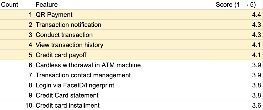
According to the survey, features belonging to transaction & credit card group are the most crucial part of the banking experience.
Analyzing the old design, we notice some pitfalls regarding this design:
Focusing too much on promotional content. For example the main CTA of the home screen is a "view your discount" not "Scan QR code" like user needs.
The hierarchy between elements is not clear → cluster interface

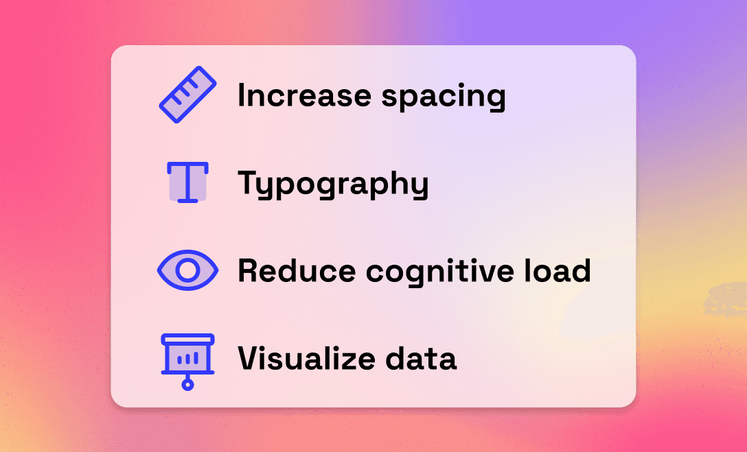
Next, I decide to redesign the homepage base on some principles:
Use spacious spacing to give the interface more breathing area
Use medium font weight the heading and increase label and paragraph font size to improve readability, and support the spacious layout
Remove or hide unnecessary information to avoid cognitive overload
Use chart and image to visualize information
The result
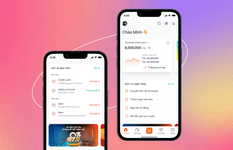
First section: Transaction & credit card overview
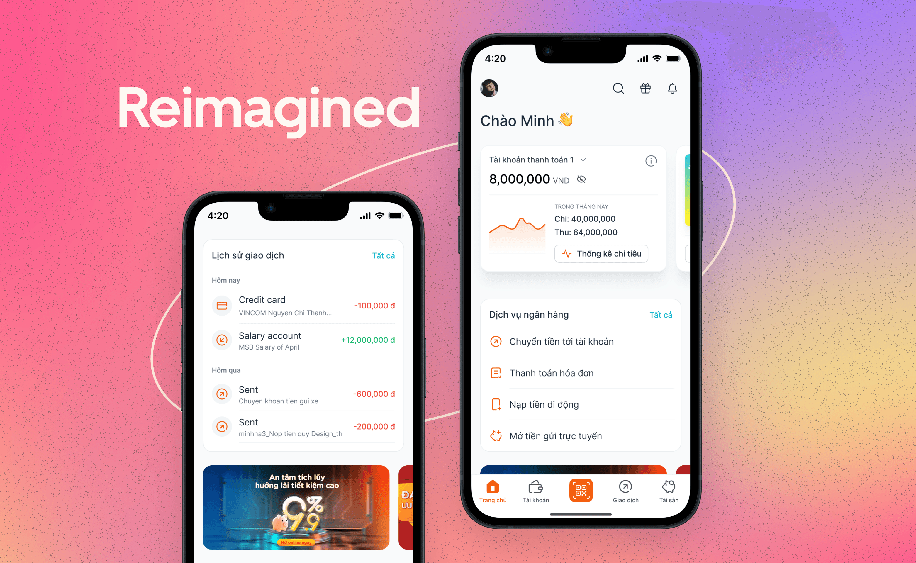
Transaction & credit card overview are the most important information that user wants to user when open the app. Thus, three main financial cards are redesigned, with chart and image to visualize the financial information. I change it from pagination UI to a card to make the next card more discoverable (40% testers feedback that they don't notice the pagination on the old design). This is also the most important section, so I add some shadows to draw user attention.
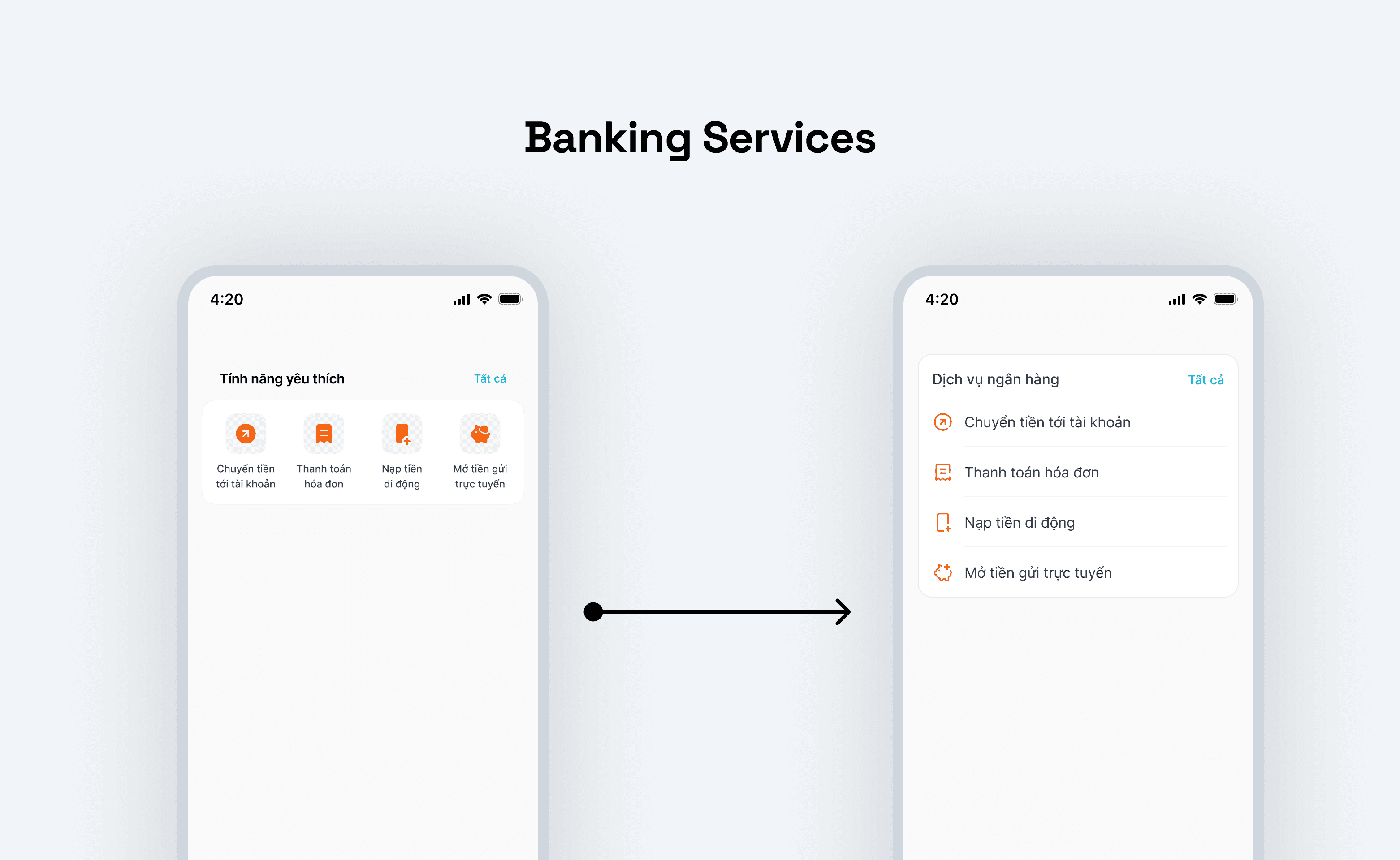
Second section: Banking services
With this section, I use a new vertical list layout, with increased font size to improve readability.
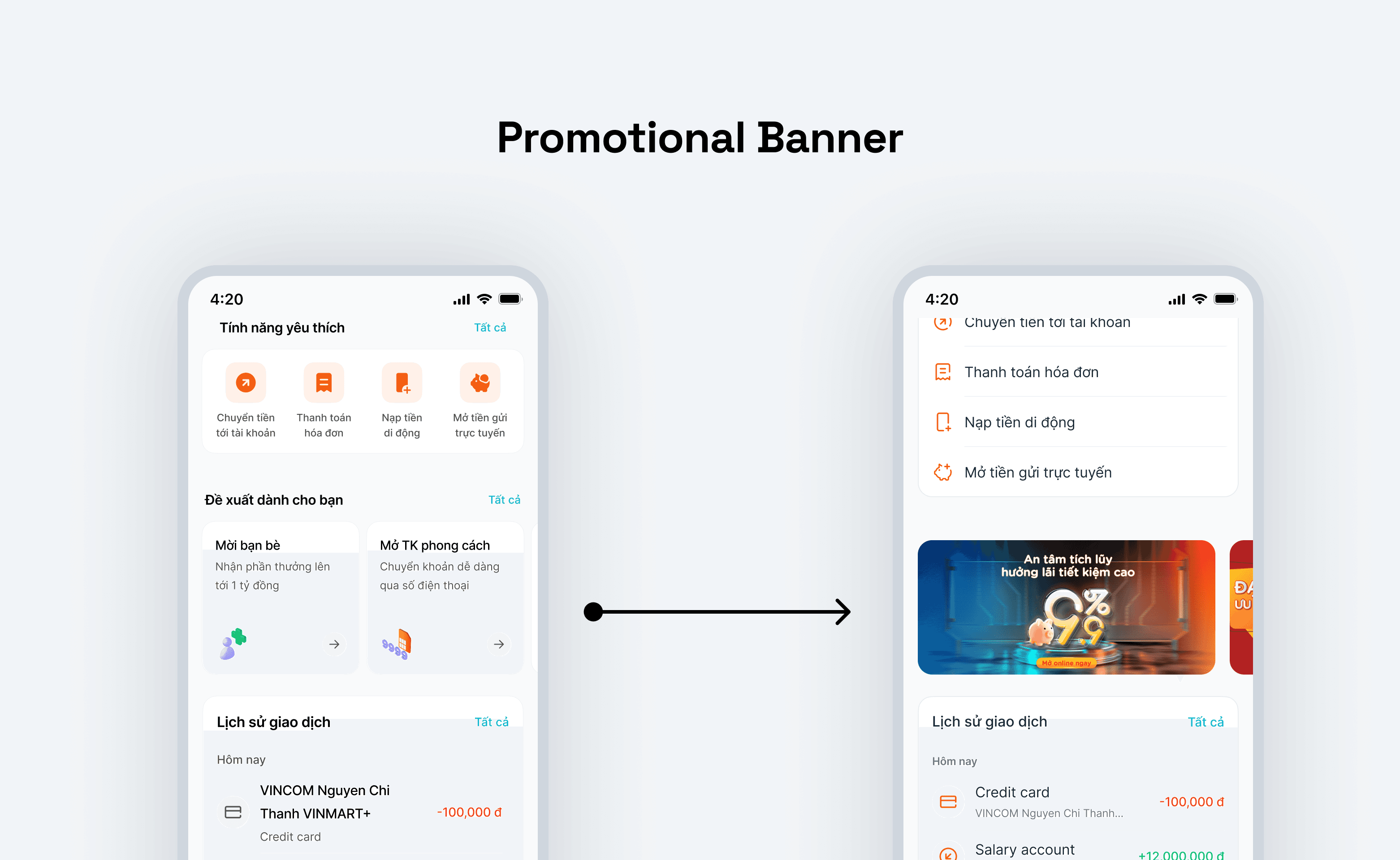
Promotional section: switch to marketing banner
I try to plug this slightly above the first fold to make sure that every customer can see the promotion without hinger other main action. To make it more attractive, I change the design to a banner type.
Third section: Differentiated transactions by types
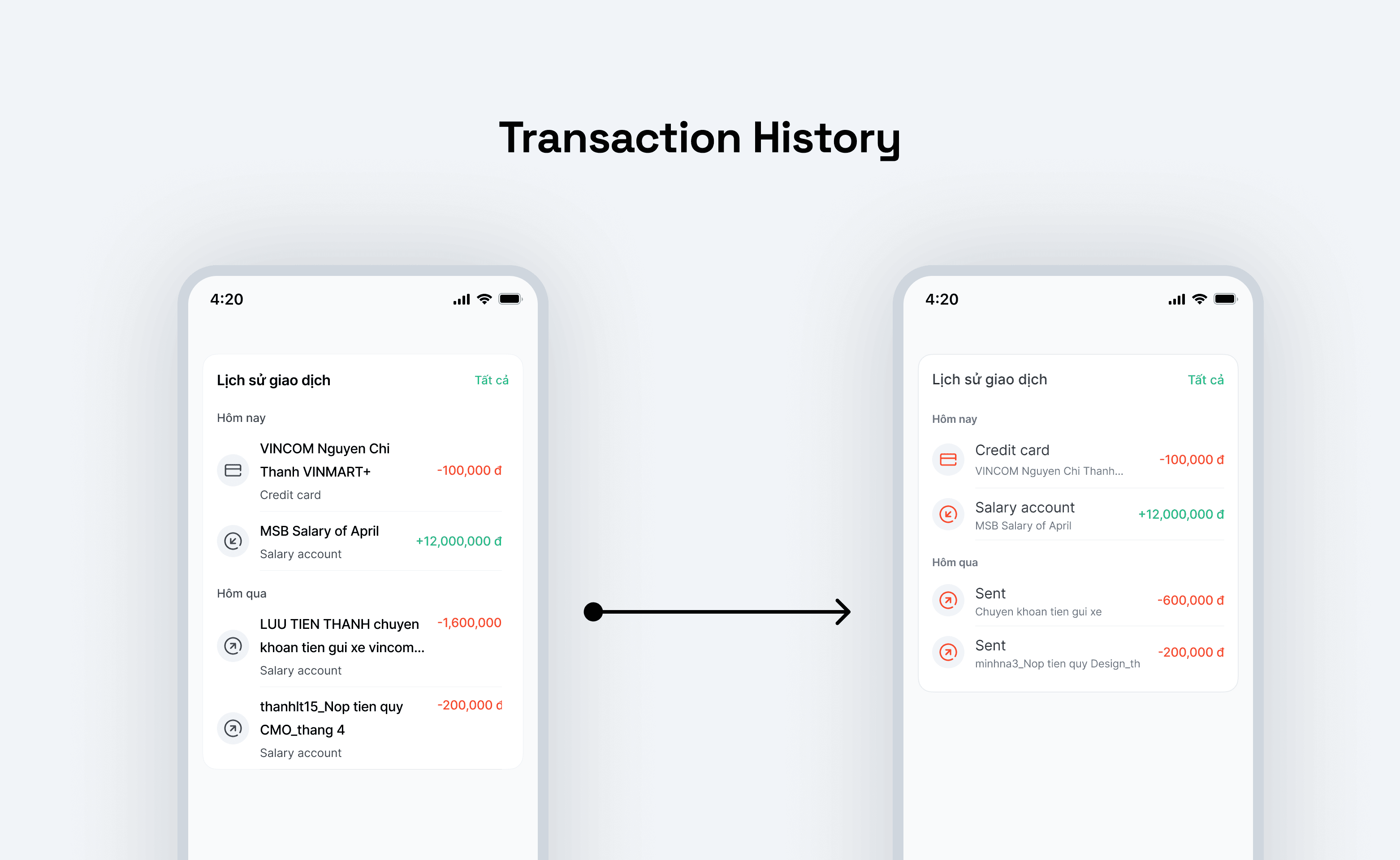
I use the type of transaction (sent, receive, payment, etc.,) as title instead of the description text to avoid lengthy heading & better scannability.