MSB Design System
Overview
I had a valuable chance to join the design system team in the middle of the development, when we finished the foundation with basic design tokens and components for the website version. Base on these, we developed the next version of the design system to cover the mobile app use case.
The design system aims to improve the design workflow of our autonomous aspect and project-based working culture in our company.
The fragmented landscape
In 2020, MSB products landscape was very fragmented, with each department ran their own platform and design system, some were outsourcing to a 3rd party agency. This makes it hard for both customers and in-house employee using MSB banking services.
Our design team was formed in 2021, within the digital transformation of the bank to attract the next generation of customers. As a result, MSB Design system was create to meet the need for rapid digitalization.
Design System structure
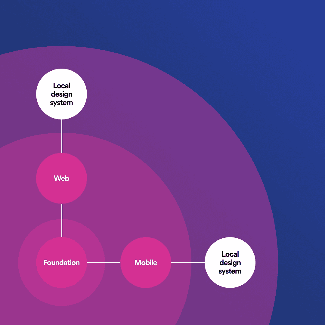
Spotify Encore design system structure
MSB design system is based on Atomic design methodology and deeply inspired by Spotify Encore “system of systems” approach. It was designed to create a comprehensive experience across multiple platforms and services, while still respect the diversify of each product team.
Similar to Spotify structure, MSB design system will also consist of 3 layers:
The core layer is the foundation: It’s where we keep things like color, type styles, motion, spacing, shadows plus guidelines for tones and voice. It’s also where our design tokens live.
The second layer is the web and mobile component, things like button, input fields,… We try to make web and mobile interface and behavior as similar as possible. However, due to the different technology landscape, there are some components that are different between mobile app and website (eg: drawer, dropdown, etc,.)
The last layer is the local design system: Local systems are a place to keep design elements that are tailored for specific products or audiences (says business owner and a individual). Local system is built by designers of the products, base on the foundation and components layout by our design system team
Key Problem
While developing the mobile app version of the design system, apart from the usual problems that every design system team will encounter. There are some major problem that we have to cover:
Firstly, many problems came up when we try scaling down the design from desktop version to mobile one. Due to company unique industry, the first version was a desktop-first, web-based design system. This is because businesses usually use their work computer to fill out long form and upload various document.
Secondly, we have to write guideline regarding how to use each component detailed and specific enough so that the next designer can easy understand and use the component properly, without hinder one creativity and uniqueness of ones product. Our team have more than 20 designers covering many aspect of the banking digital landscape, designing an one size fit all solution is simply not enough!
The Takeaway
Personally, as a mid level product designer at that time, joining a huge project like this is an exceptional way to learn from best designers in our team. I learned about their thought process, how they solve a UI or UX problem by making trade off where it worth.