CarNow Home Screen Redesign: Increase 50% Click-through Rate
Domain
Marketplace, E-commerce
Team
1 Product Designer. 1 Leader
Duration
2 weeks
Impact
↑ 50%
Increase in Home Screen to Product Details Page CTR
↑ 12%
Increase in Call dealer CTA
x2
Average watch time
The challenge
The Board of Director decided that short-form video content will be one of our USP. The first version of the interface was similar to an Instagram feed. Unfortunately, 6 months later, with various push for this feature from Sales and Marketing departments, the adaptation rate was lower than expectation.
Goals
To improve the product, our initial goals were
1.
Audit current
homescreen version
2.
Make data-informed
improvements accordingly
My role
Under the guidance of anh Sang Le - my design lead, I was the main designer of the project. My main tasks included:
Audit the current interface using qualitative & quantitative data
Customers insights & ideation
Pitch Presentation
UI & UX Execution

Design Process
We first auditted the current design using Posthog. I also noticed the video playback is choppy frequently so I arranged a quick interview with our tech lead to understand the technical challenge.
Findings
Low adoption rate
only 20% of the listing was video
Low watch time
users only spent 1-2s per video
Performance bottleneck
BE infrastructure couldn't handle video auto playback smoothly
Insight
Due to time constrain, we couldn't conduct a user research. Instead we found two evidence to drive our decision:
User insights from our customer success team: They talk to our users everyday and understand them deeply. We found out that one question they asked users is "Do you have a specific car brands /models in mind". Most DO
Base on this answer, we then verified it with Posthog. Indeed, 72% users use filter
Using Session Replay, we noticed an interesting pattern: user swiped videos quickly, if they found some models that match their interest, they will watch video for a few seconds and click to view the product details for images and more information
These evidences leaded to my problem statement:
Users open our app with a specific car models in mind, preferring to search before viewing media. However, the home screen disrupts this flow by distracting them with random autoplay videos.
Explore: Redesign for YouTube-like home screen
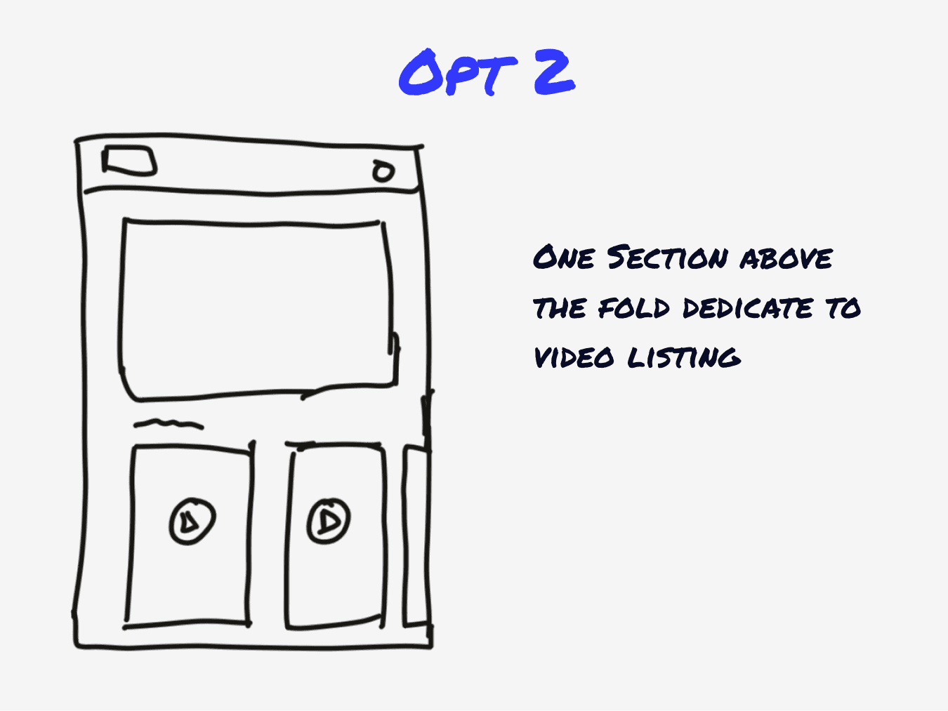
How might we provide a skimmable home screen that balance between video and image card
After desk research and wireframing, we decided to go with the "YouTube" direction, because it balanced both image listing and short video listing within a feed.


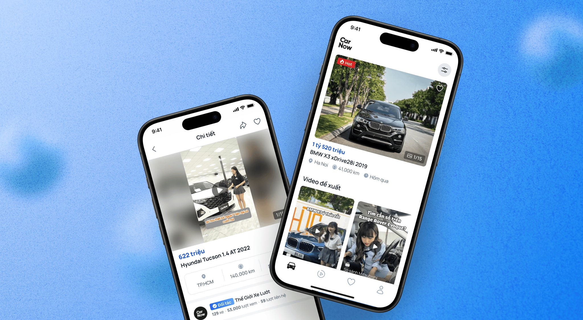
Outcomes: Better for user experience & performance
The new UI removed the auto play features, improved performance, reduce cognitive overload. It also allowed user to see more listing in one fold
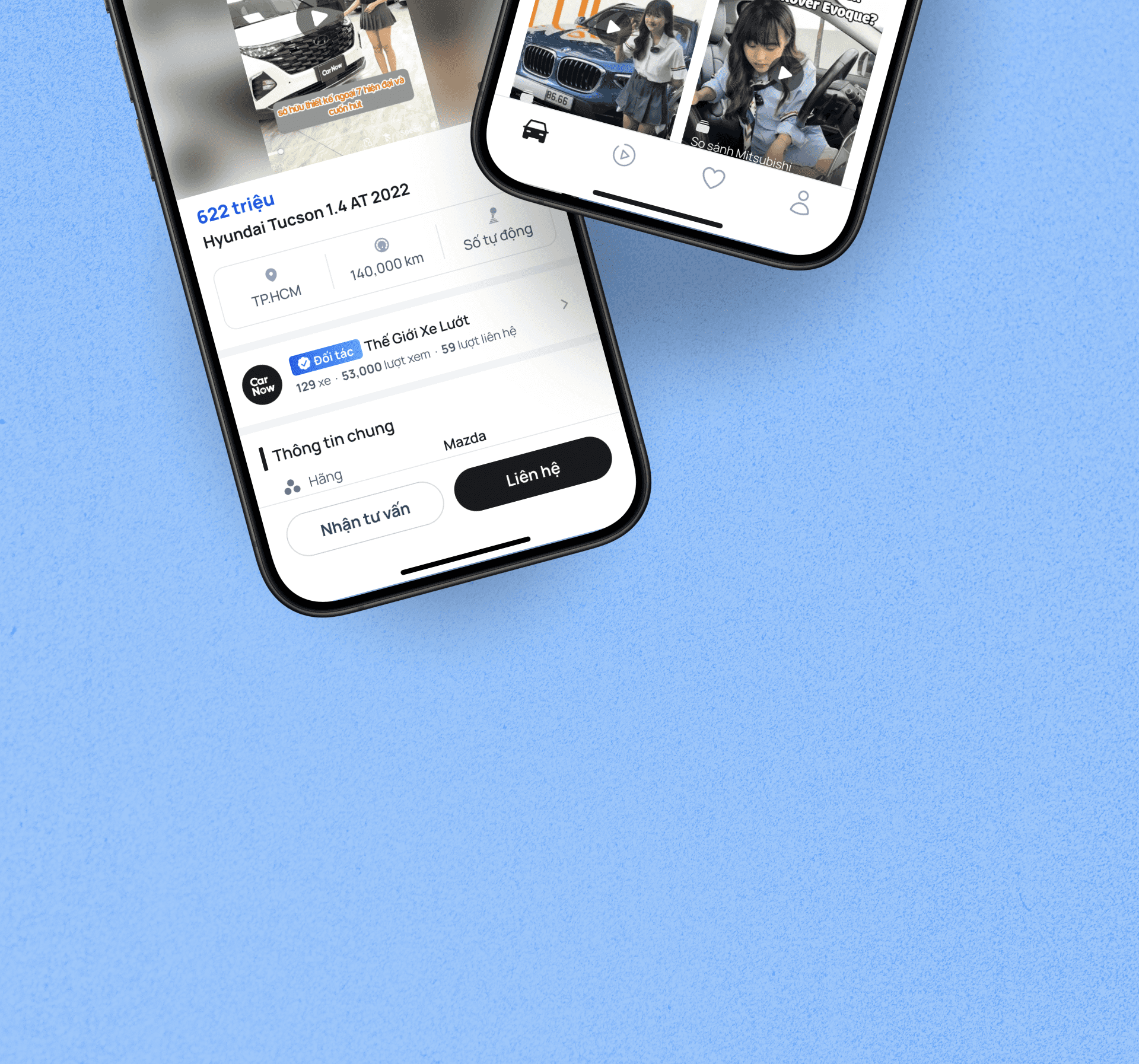
Disclaimer: due to the ever evolving of digital product, the live UI might be different from the case study