UX best practice for ecommerce homepage
May 12, 2024
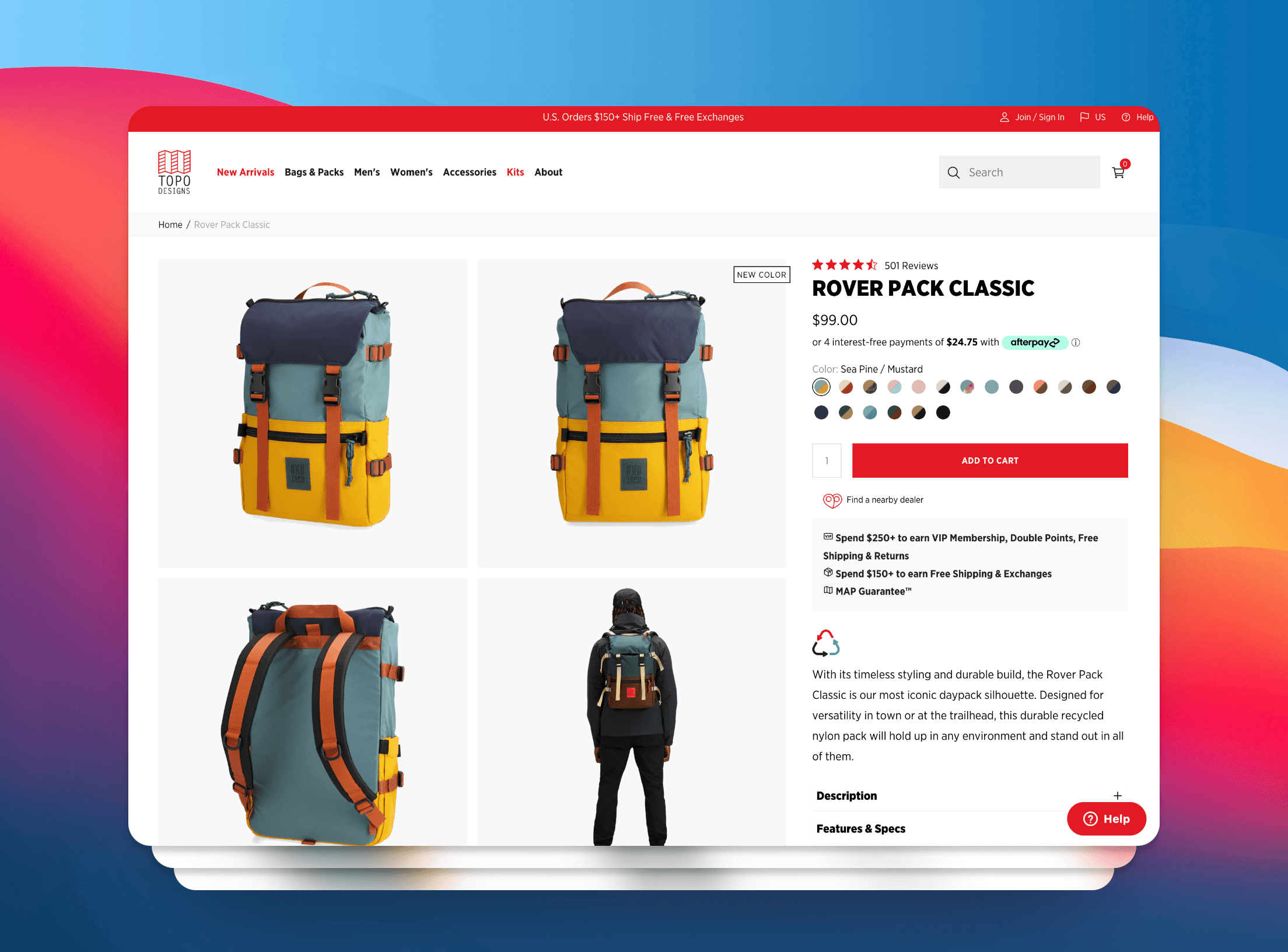
Baymard is a institution that research heavily on ecommerce website to create the best user experience. Here is their take on how to build a homepage.
My team summarize this tips a few years ago, and now, I add some example to make this point clear. I think these tips not only works on ecom site but also every company's website, since we all try to sell something.
General components
Announcement bar

Position: top or bottom for email signup
Announcement bar should be closable and collapsible when scroll down to avoid distraction.
Header

Store's name & logo
- Link to home page
- On top or top left or left
- Only display the store logo on mobile, put the rest of the menu in hamburger menu
Search icon/bar
- Easy to spot on
- Provide a submit button on mobile
- Right side
Cart drawer
- Right side
- Showing 0 by default
Hamburger menu
- Mobile only
- Right side
Menu link

- In the center or near the left
- Inside hamburger in mobile
- Make Product Categories the First Level of the Main Navigation
- Hover delay: 300-500ms (desktop) to make sure the dropdown menu don’t accidentally close
- Highlight current screen location in the menu navigation
Add to cart behavior

When adding products to cart, the cart icon will update the number of products and the cart drawer or pop-up is showing
After users add a product to the cart, they’ll want to either:
- Go to the cart,
- Continue shopping, or
- Skip the cart to go deeper in the checkout
→ Therefore, consider making the paths to “View Cart” and “Checkout” equally visually dominant. In addition, users should also be provided with an option to “Continue Shopping”
Auto Update Cart Quantity Changes Instantly and Allow Quantity 0: Once a new quantity is entered, the cart summary and order total must update, as there will otherwise be potentially conflicting information in the interface. Note that there should be a slight delay (e.g., 200–300ms) before auto updating to allow users to type double-digit quantities with ease (e.g., “21”, without it auto updating on “2”)
Footer

- The footer might include menus, social media icons, contact information, or a newsletter signup.
- Have shipping & return information
- Have FAQ link
- Divide footer link to separate section for easy scanning
Homepage
Hero section

- Load search and main navigation first
- Hero banner/slideshow with clear CTA
- Contain product image
- 5-7s for rotating slideshow delay, exception: 10s for text heavy slide
- Pause when hovering
- Have carousel control
- For mobile: avoid carousel auto rotation
About us section

- To increase trust. This section should have a quick description about your brand: story, values, material, ingredients or manufacturing quality and mantra.
- Link to collection pages (main) about us or contact us page (secondary)
Feature collections section

- Display all store’s collections or some featured collections to avoid misinterpreting
- Important on mobile → should put this near the beginning
Feature Representative Sample of Products
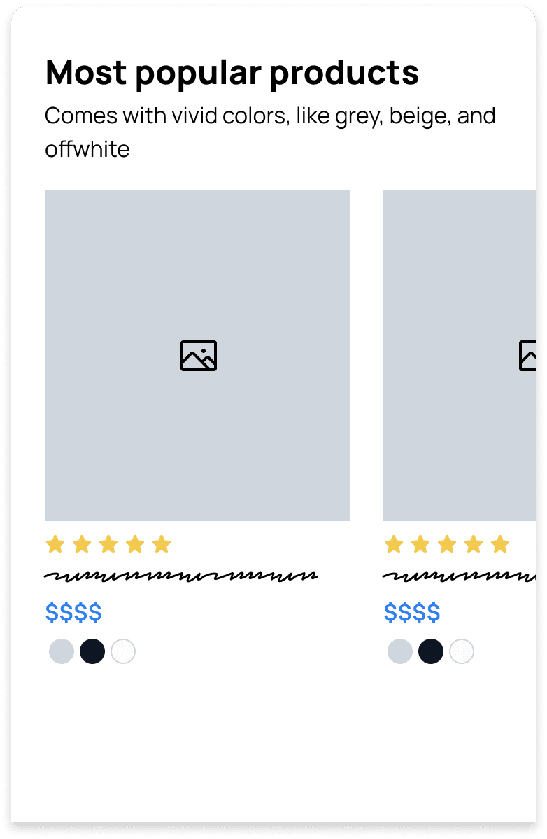
For small catalog site: show at least half of the total product
For large one: at least 1 product per product type or collection
Separate each featured product list with heading, Moreover, each product card should contain
- Link to product page
- Color swatch
- Rating
- Other industrial specific info
Always Highlight core product features on the homepage
Feature key product and their USP

Show Customer reviews and testimonials with Photo and Ratings

Showing benefit bar

Display Social feed
