Mind the Gap - A guide to master spacing principle
Oct 6, 2024

Spacing is all about organize the relationship between elements
Spacing, the black magic of interface design. When done right, spacing can create a harmonious, organized layout; when neglected, it can leave users feeling disoriented and uncomfortable.
That’s because spacing influence the white space, the invincible part that, in most case, occupies more than half of a screen's real estate. Mastering spacing is mastering the gap between components. This creates a sense of organization, establishes relationship between elements.
In this post, I will show you how I space the elements in my screen to create a harmonious design
Let's start with the basics: define your spacing system
The go-to base number in interface design is 16 pixels. It's the perfect Goldilocks number: not too big, not too small, but juuuust right. It divides and multiplies nicely, and conveniently happens to be the default font size in every browsers.
Typically, spacing below 16 pixels increases in smaller increments: 4, 8, or 12 pixels, while larger spacing uses more generous intervals.

*The 20-pixel spacing is reserved for typography only
Next, define the relationship using the friendship relationship
In short, use spacing to group related element with each other. The closer the relationship is, the smaller the gap between elements. Mastering spacing help your layout feels organize.
That’s sound simple at first, but in practice, you can find yourself baffling between 16px and 12px, or worst, space everything evenly
Introducing the Spacing Friendship relationship. This is a concept I learn from Tess Gadd. In a nutshell, it’s a cheeky way to group the element base on their friendship circle.

Here are some example of common elements
Heading and supporting text are best friends (or even BFF) because they can’t live without each other.
Input fields are close friends, as they share a similar purpose, even though they have distinct roles.
Text and button are close-ish friends because you typically see them with together, but some times they like to do things separately
Apply this "spacing friendship" system, and suddenly your layouts will start feeling more organized than a Marie Kondo closet. Take a look at this contact page example:
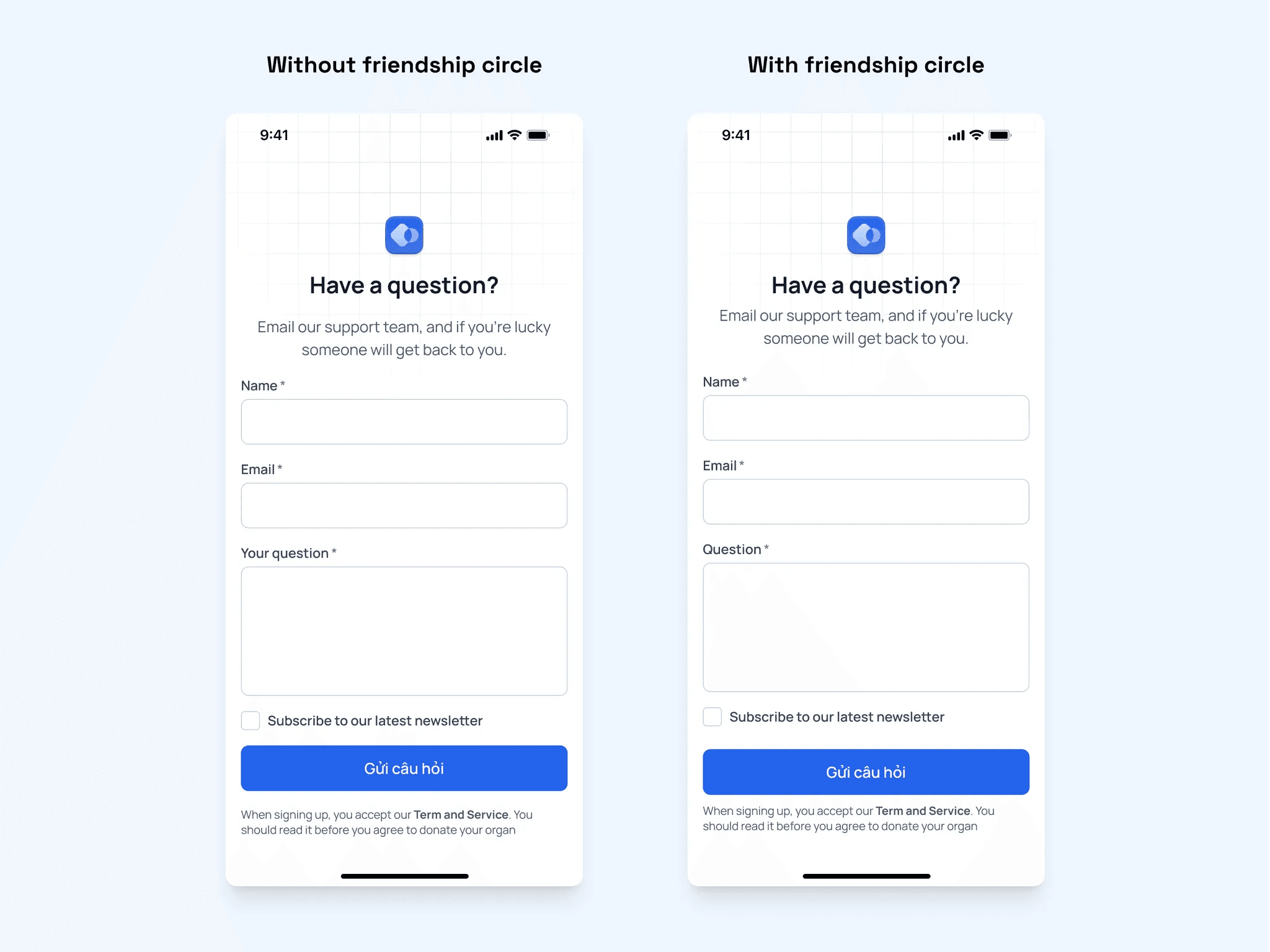
You can see the left one looks floaty and imbalance, while the right seems much better organize. Let’s break down how I organize the screen using the friendship circle method:
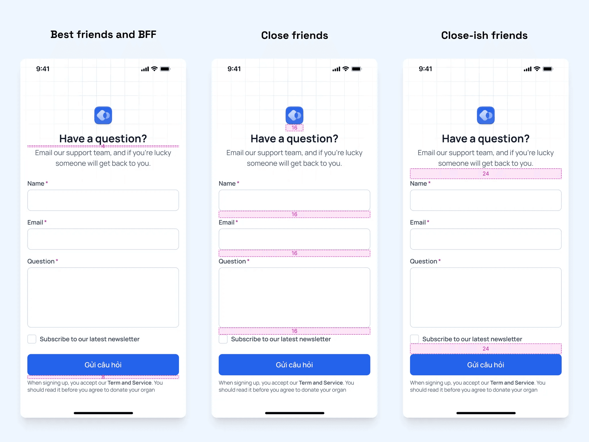
Notice how I use 4px instead of 8px to space the heading and subtext? More on that later
Now that you have learn the basis, here are some practical tips on applying this method in real life.
Use 8, 16, 24 as a starting point
8, 16, and 24 pixels are classic spacing guidelines. Start with these when you first establish your elements' friendships, then adjust as needed.
Aim for visually balance
When spacing text & icon, visually balance is more important than technical balance
Remember how I use 4px between heading and subtext? Yet, the gap between the heading-subtext and button-text is still “feel” equal. This is text actually have often have built-in spacing with the line-height property.

Because of this white space, these gaps is visually equal. While technically, the bottom one is twice as big. This result in the gap between texts is typically 4px smaller than between other elements (ex: cards, button), while still remain in the same friendship group.

Another example is icon. Icon also has roughly 2px safe space between the container and the vector itself. That’s why when design button or chip, experienced designers usually reduce the padding by 2px on the icon side to account for this space

The padding may seems balance, while actually, the right padding is slightly smaller